Project
Crazy Mountain, Live Wide Open
Prepared by
Eric VillalobosWatsonville, California
| Line | Item | Field |
|---|---|---|
| 01 | Crazy Mountain, Live Wide OpenProject | Project |
| 02 | Packaging & LabelsDiscipline | Discipline |
| 03 | Brand IdentityDiscipline | Discipline |
| 04 | Merch & ApparelDiscipline | Discipline |
| 05 | 5Plates | Plates |
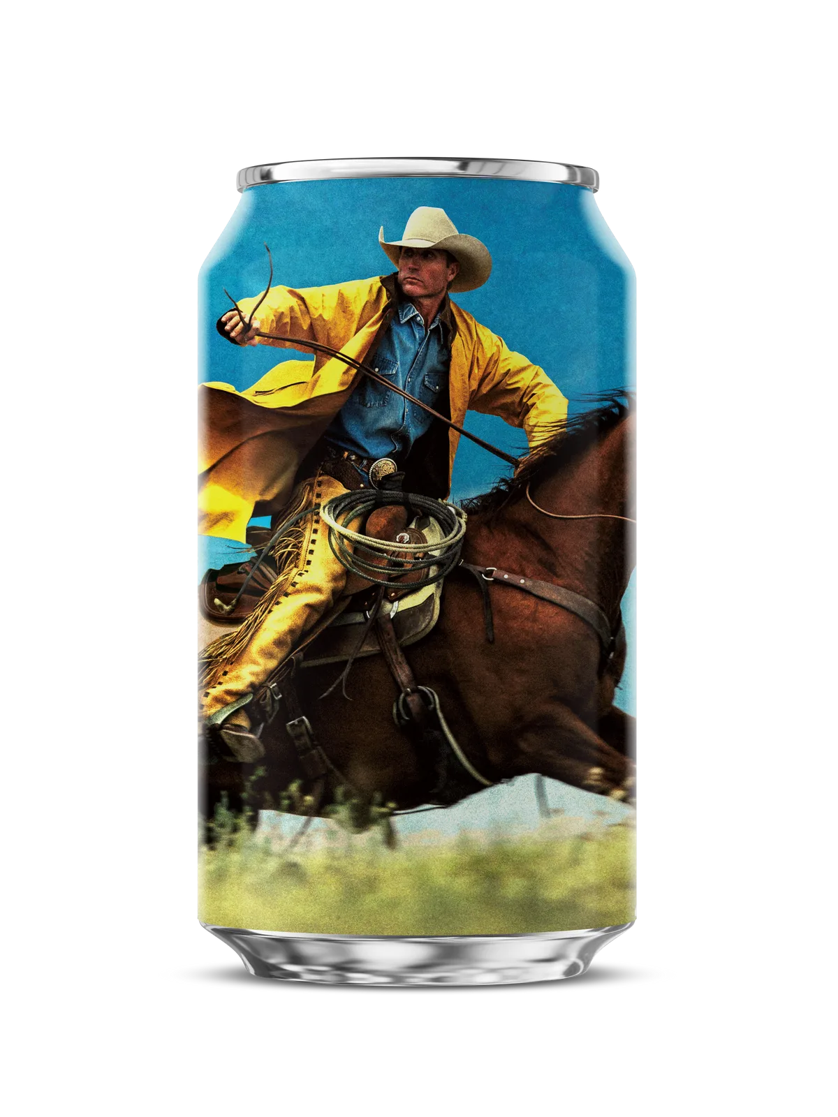
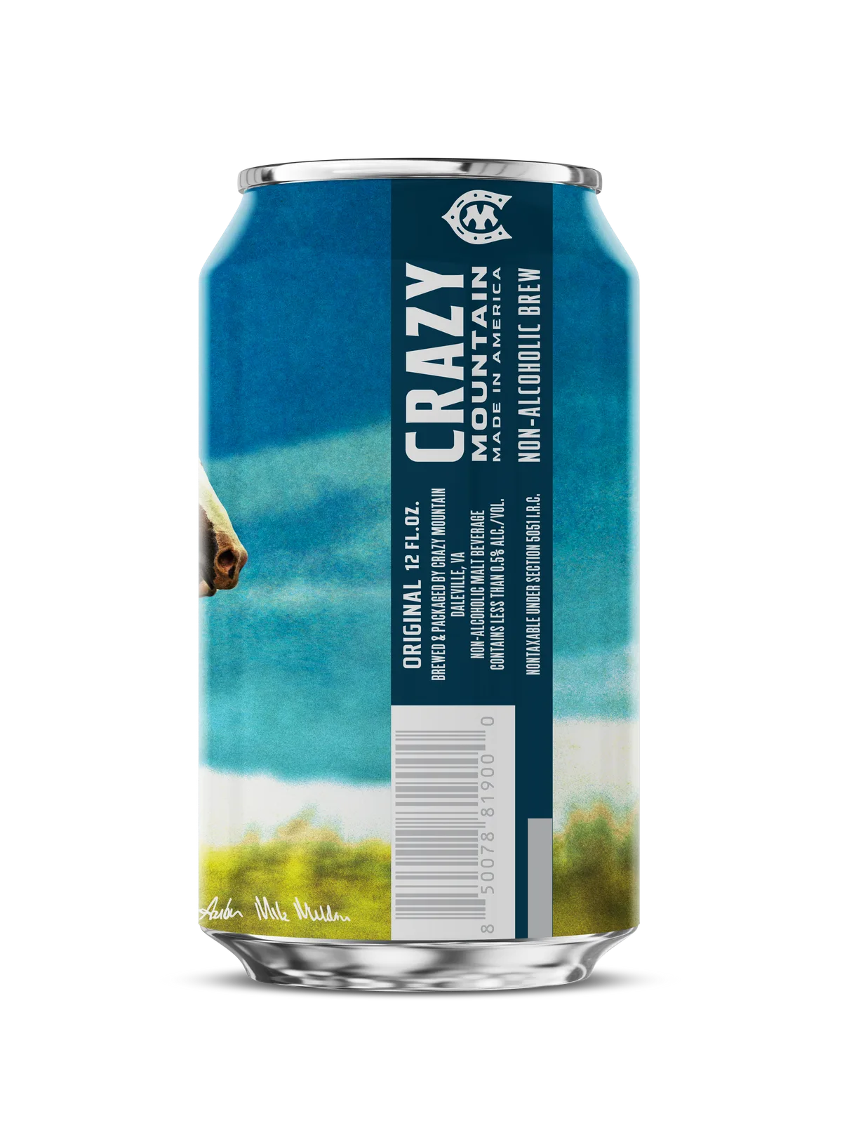
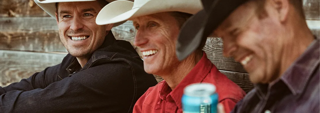
Creative campaign exploration for Crazy Mountain non-alcoholic beer. Three concepts were developed around the line Live Wide Open. Horizon places the can against a wide landscape with cowboys, surfers, and bikers as the tribe. Freedom centers the product with a green-glow treatment and the line Beer Only Freer. Good Times uses a deep red social frame with the can tilted into the scene. Each direction uses the same gold and cream palette so the family stays recognizable.
Crazy Mountain makes non-alcoholic beer for people who still want the occasion. The campaign exploration starts from that premise: the beer should look like it belongs at the same moments as the full-strength stuff.
Live Wide Open is the master line. Horizon visualizes it literally - a gradient landscape, the can at the bottom edge, the logo in the upper right, and the tribe listed as cowboys, surfers, bikers. The palette is earth, green, and gold.
Beer Only Freer narrows the argument. A dark green frame, the can centered and slightly rotated, and the claim that non-alc does not mean less taste. The lighting is product-first.
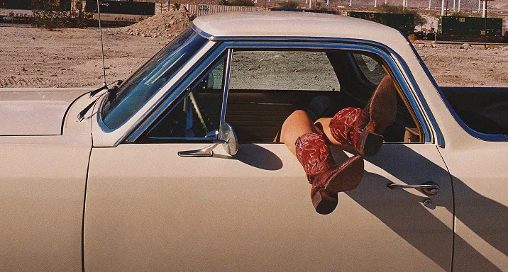
Good Times drops the argument and goes for atmosphere. A deep red social frame, the can tilted into the bottom of the shot, and the line WITHOUT COMPROMISE as the closer. The direction is built for Instagram rather than the shelf.
All three share the same gold accent, the same cream type, and the same logo placement habit. The campaign is modular: one brand, three attitudes, one set of assets.