Project
Risograph3000
Prepared by
Eric VillalobosWatsonville, California
| Line | Item | Field |
|---|---|---|
| 01 | Risograph3000Project | Project |
| 02 | Own projectClient | Client |
| 03 | Print & EditorialDiscipline | Discipline |
| 04 | Poster DesignDiscipline | Discipline |
| 05 | IllustrationDiscipline | Discipline |
| 06 | 11Plates | Plates |
| 07 | riso3000.fly.devLive | Live |
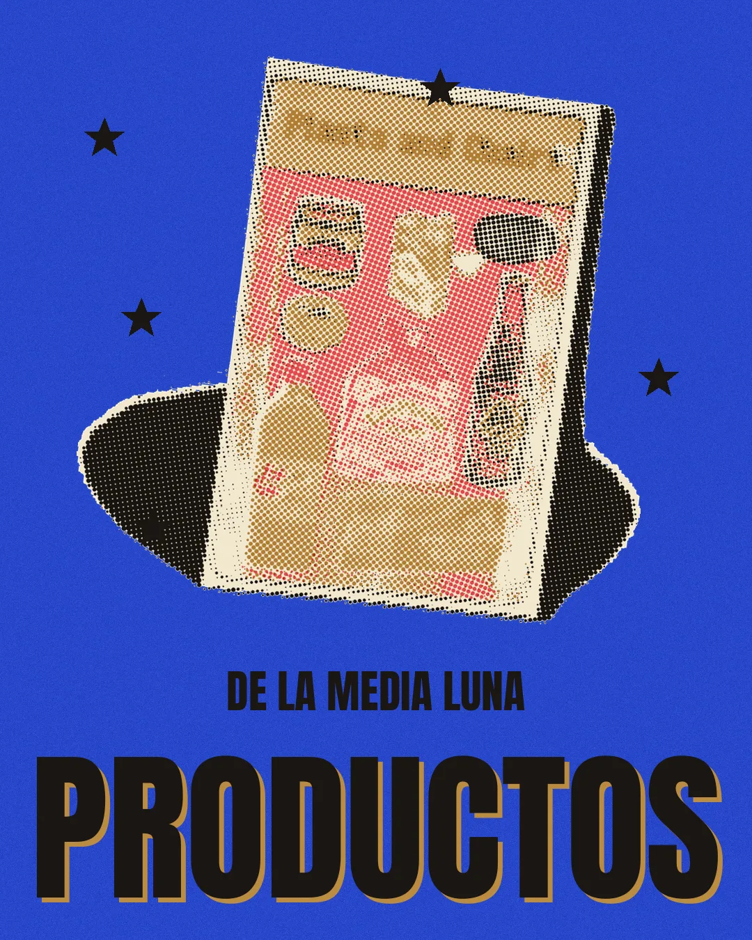
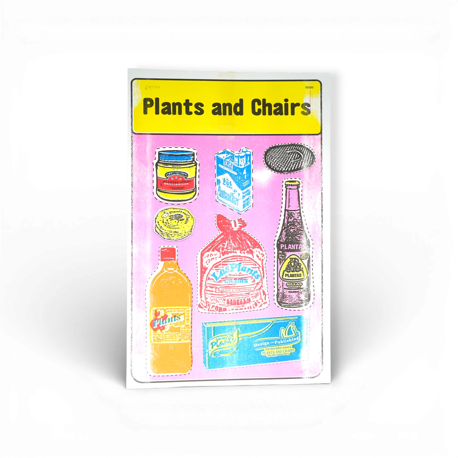
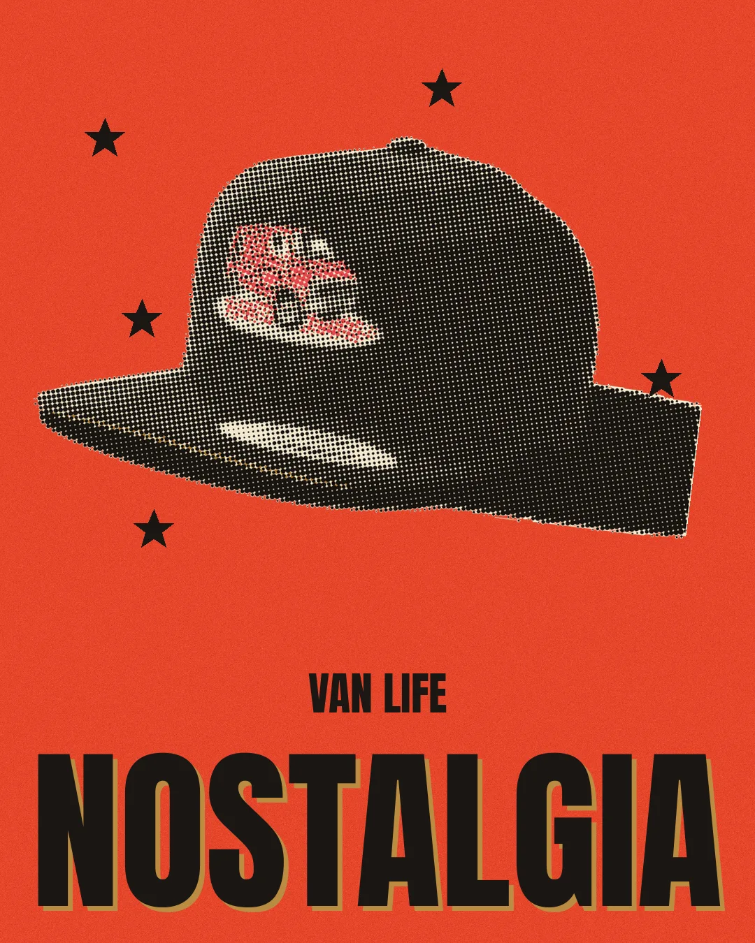
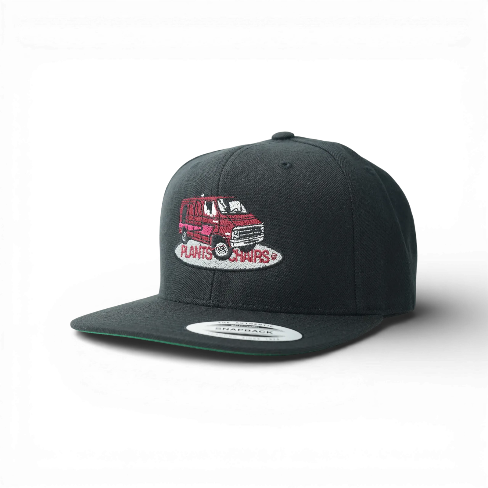
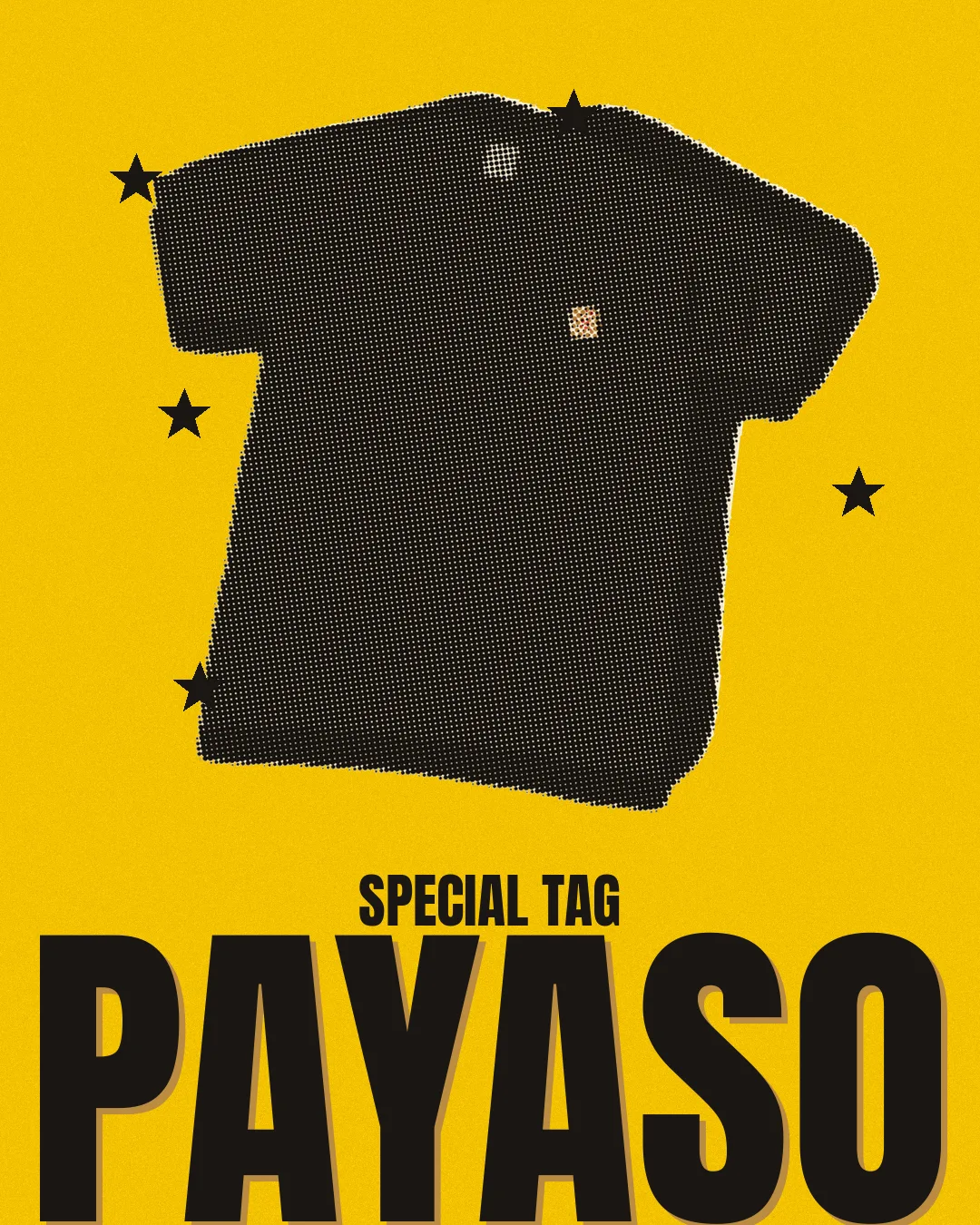
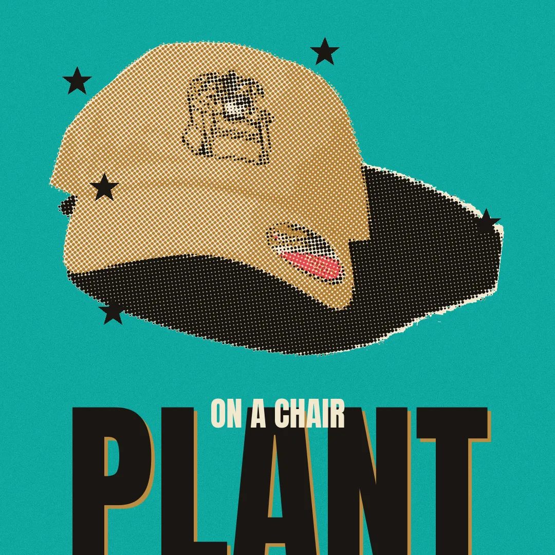
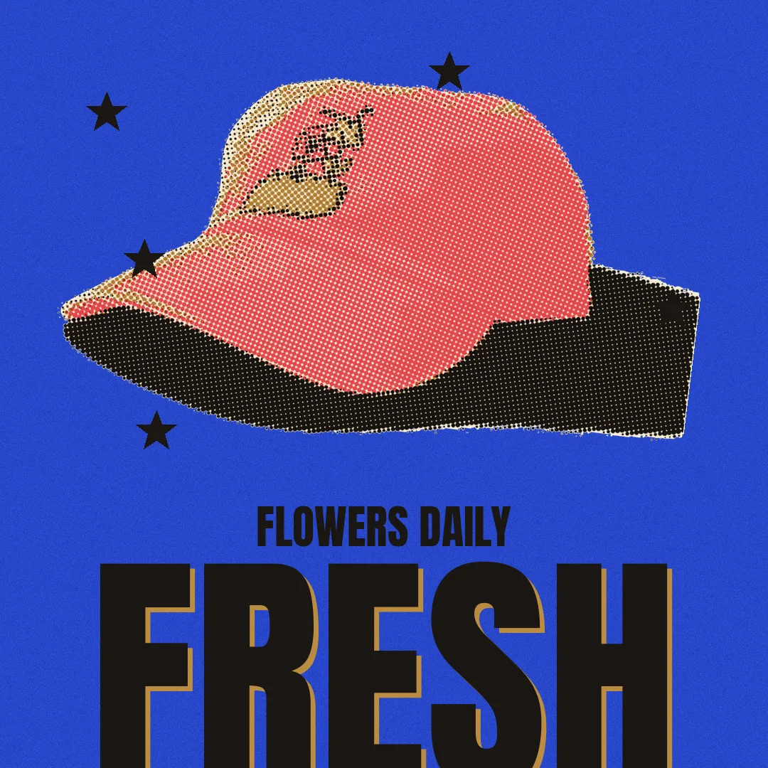
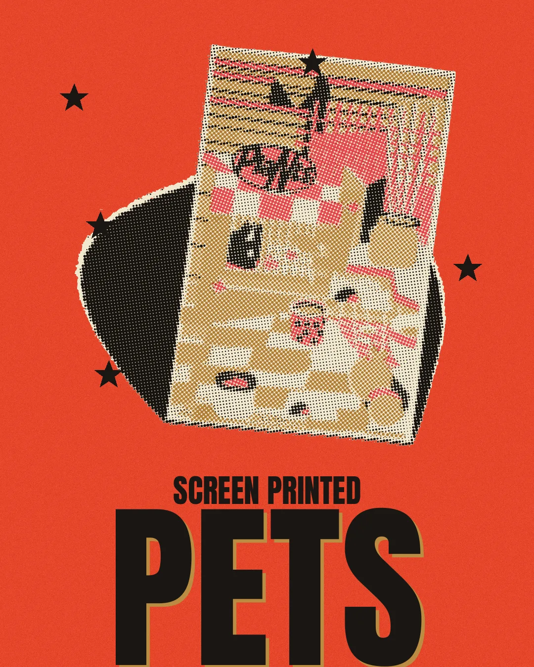
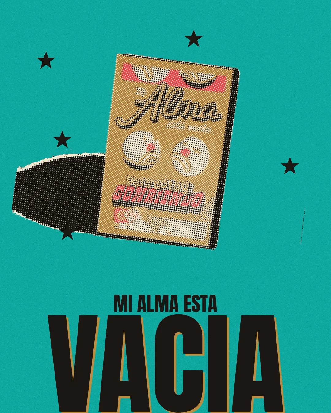
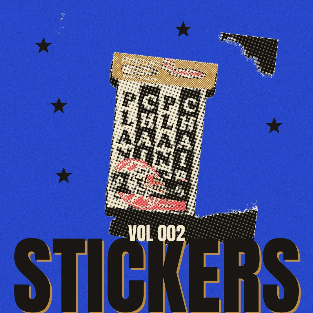
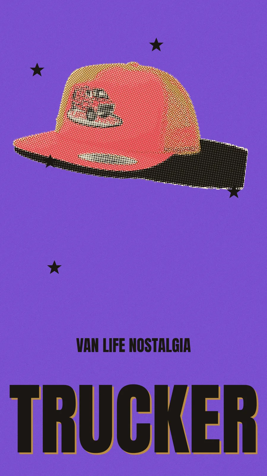
RISO3000 is the Plants and Chairs risograph print-effect engine. It started as an interactive proofing studio and became a headless Python compositor: LAB spot-ink separation, angled mechanical halftone per plate, 1-4px plate misregistration, multiply overprint on cream stock. An autonomous pipeline runs the full merch catalog through it, every product, three Instagram formats, no clicks.
Plants and Chairs sells printed things, so the ads have to look printed: flat spot inks, visible halftone dots, plates a couple of pixels off register. Faking that by hand in a design app works for one poster. It does not work for a 19-product catalog in three formats, every drop.
RISO3000 started as an interactive HTML studio, load an image, pick real Risograph drum inks, proof the separation on screen. It proved the look. Then we ported the logic into a headless Python engine (csa-engine) that an agent can run: LAB-space spot-color separation, angled mechanical halftone per plate, 1-4px misregistration, multiply overprint on cream paper. Never pure white. Two to four inks, period.
The engine carries three layout registers, each held to a written style contract of ten visual laws codified from Charles S. Anderson / Pop Ink research. Hero: one product framed as a trophy on cream with a gold halftone badge disc. Specimen: catalog-page tiling. Field: the product halftoned onto a saturated flat color ground, Can Can green, hot pink, Oakland gold, with a huge condensed headline bleeding off the bottom edge.
A pipeline agent closes the loop. Drop a clean product shot in a folder; the agent separates, screens, composites, and exports portrait, square, and story; posts proofs to Slack for review; logs the run to Airtable. The full merch catalog renders in one pass. Print QA locked the halftone floor at a 10px cell, finer collapses the dot grain at feed size, and that constraint now lives in the tool, not in someone's memory.
The before/after is the case: a flat product photo goes in, a two-to-four-ink riso ad comes out, with the dot structure and off-register plates of the real machine. We build our own print tools because the look we sell is a printing process, and the only honest way to fake a press is to simulate it.