Project
ACCELERANDO
Prepared by
Eric VillalobosWatsonville, California
| Line | Item | Field |
|---|---|---|
| 01 | ACCELERANDOProject | Project |
| 02 | Own projectClient | Client |
| 03 | Motion & SocialDiscipline | Discipline |
| 04 | Brand IdentityDiscipline | Discipline |
| 05 | Web & DigitalDiscipline | Discipline |
| 06 | 8Plates | Plates |
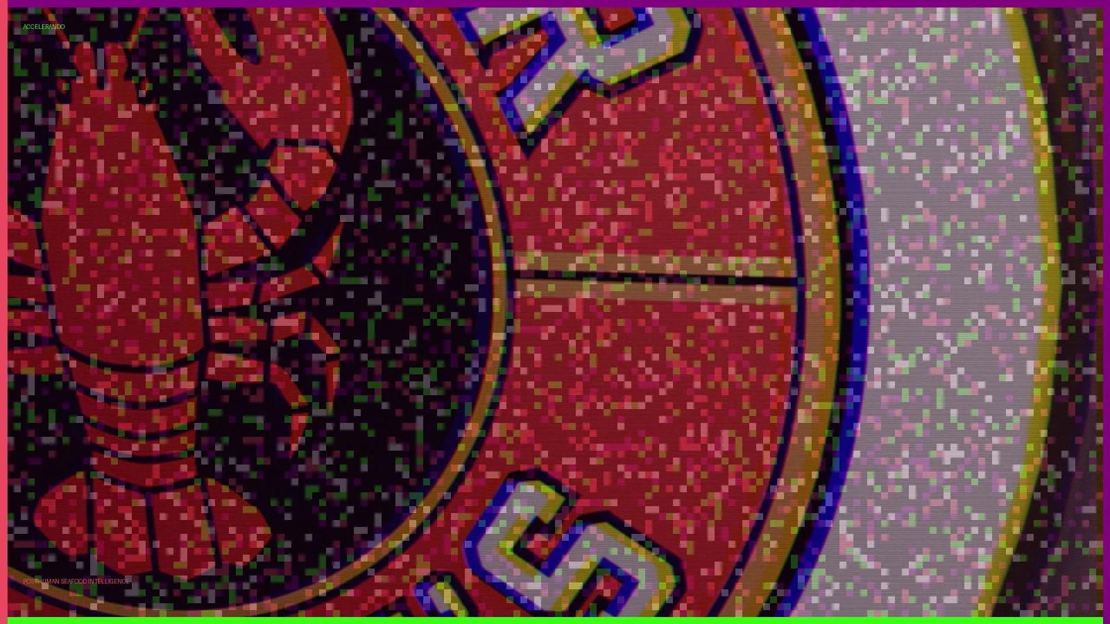
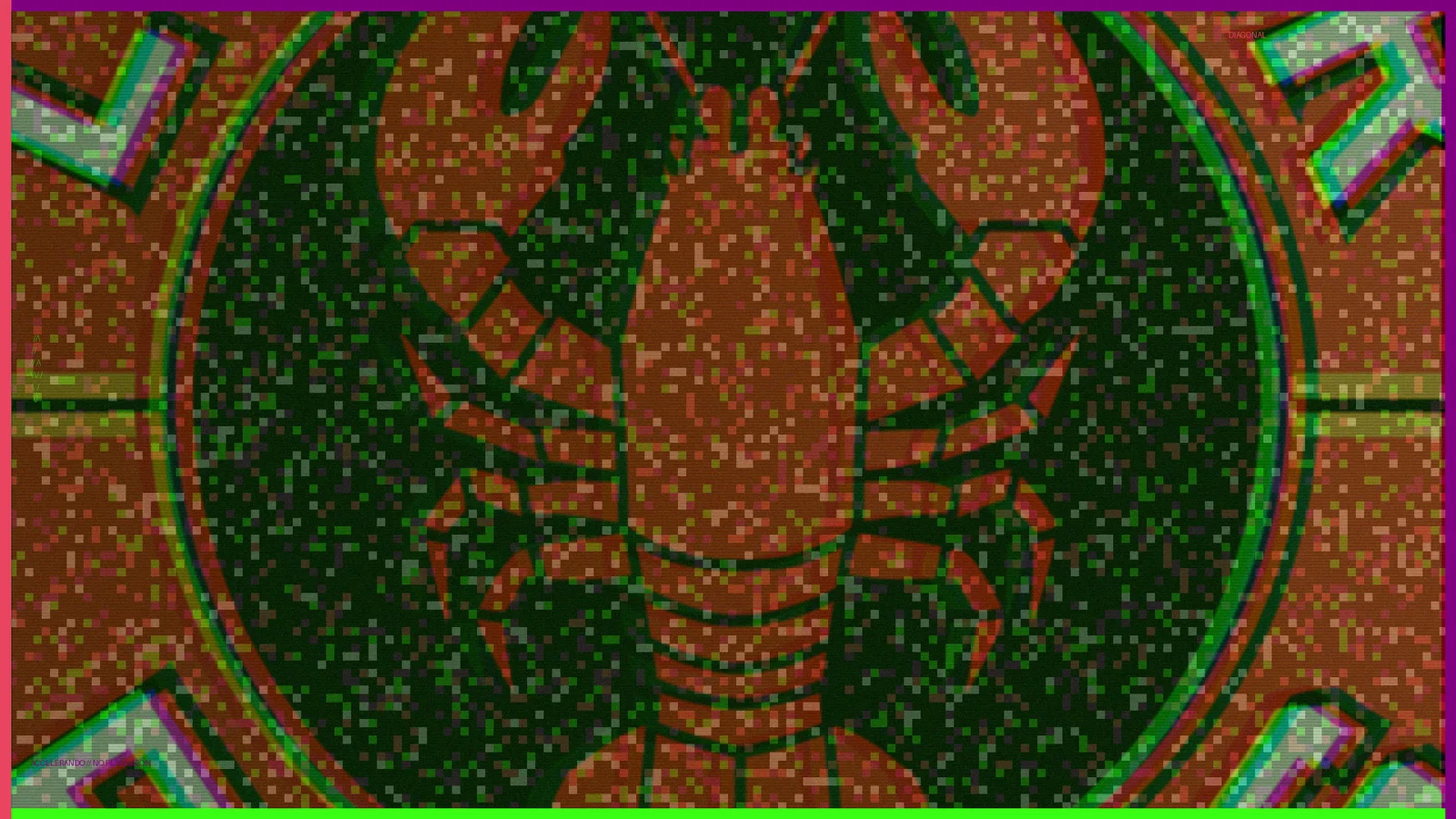
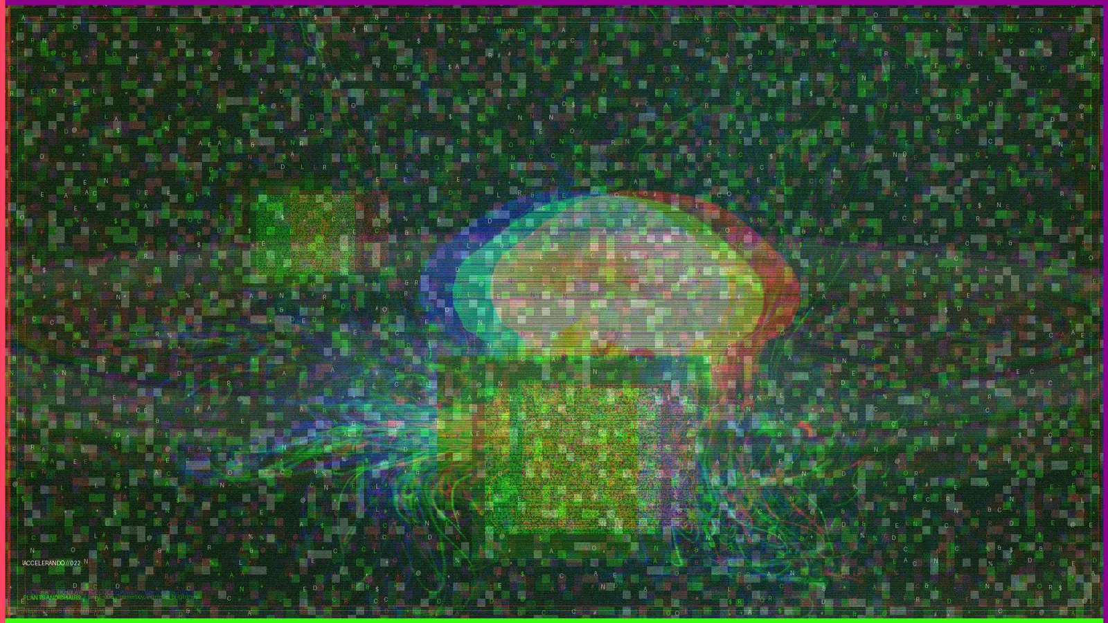
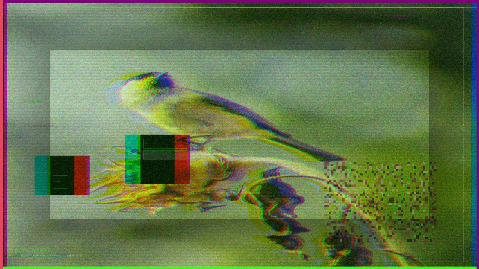
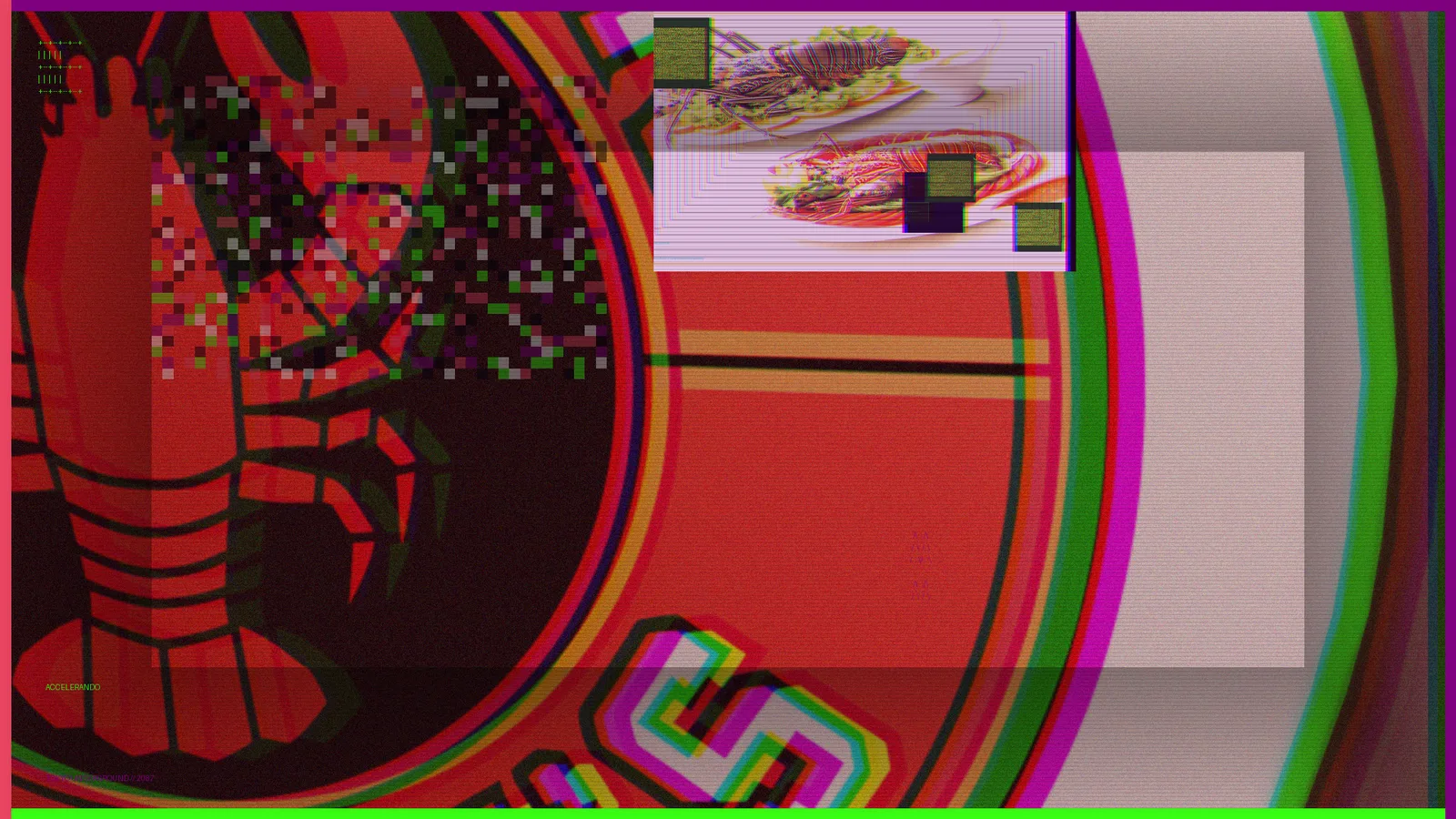
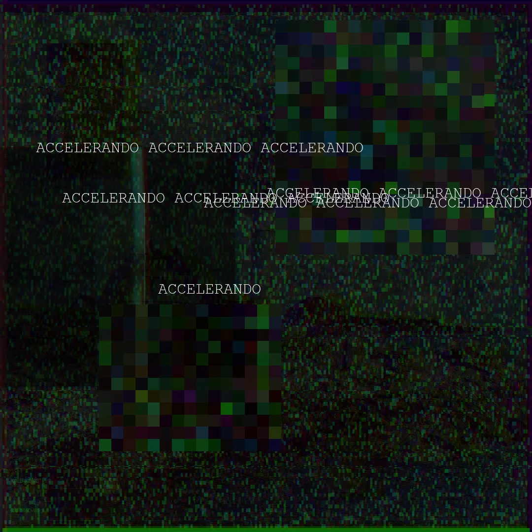
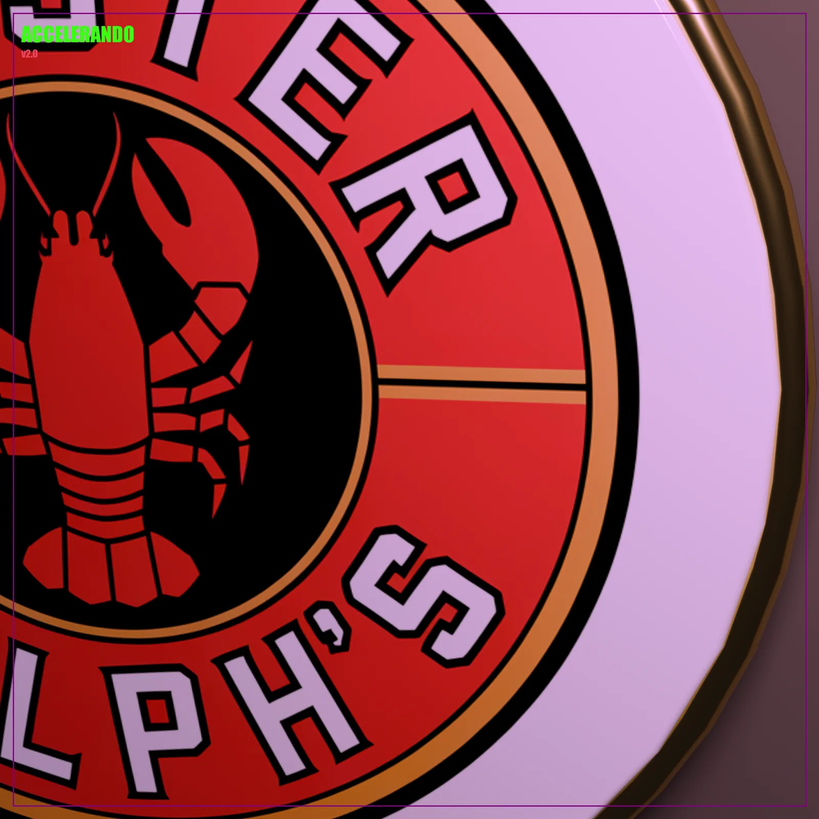
ACCELERANDO is a brand we built for ourselves, a studio-within-the-studio that unifies the Lobster Ralph's client work (PC-026) and the Studio Afterlife ritual engine under one identity. ASCII display type, a five-color phosphor palette on black ink, and an agent-run collage pipeline that generates the visual output. Live at accelerando.fly.dev; the mark also exists as a physical sign render.
ACCELERANDO is what we build for ourselves: a brand house with the tagline 'posthuman seafood intelligence.' It started as two separate things, Lobster Ralph's (PC-026), a restaurant brand built end-to-end by agents, and Studio Afterlife, the deterministic ritual engine that powers the output, and we unified them under one identity in May 2026, extracted into its own repo with a single deploy target.
The identity is a hard contract. All display type is ASCII art, no rendered fonts for headers, monospace stack only. The palette is five tokens and nothing else: void purple #800080, phosphor green #39FF14, rusted red #E94560, bone #F5F5DC, on black ink #0A0A0A. The voice is punk manifesto, Tokyo Underground, cosmic, raw, technical. The visual output shown here comes from the production pipeline: Python collage builders compositing glitch, datamosh, and ASCII elements into hero comps, with revised and best-of composition passes curated from a 6.8GB asset library.
It ships in two directions. Digital: a static site live at accelerando.fly.dev (nginx, single container, no build step) carrying the homepage, the Studio Afterlife product page, and the Lobster Ralph's case study, with a full restructure brief drafted to turn it from a gallery into a living studio dashboard. Physical: the mark rendered as a real sign, photographed clean and in-world. The whole thing doubles as proof of process, the same agents that built the client work built the brand that presents it.