Project
KEEP, Refillable Cannabis Gummy Brand
Prepared by
Eric VillalobosWatsonville, California
| Line | Item | Field |
|---|---|---|
| 01 | KEEP, Refillable Cannabis Gummy BrandProject | Project |
| 02 | Packaging & LabelsDiscipline | Discipline |
| 03 | Brand IdentityDiscipline | Discipline |
| 04 | CannabisDiscipline | Discipline |
| 05 | 8Plates | Plates |
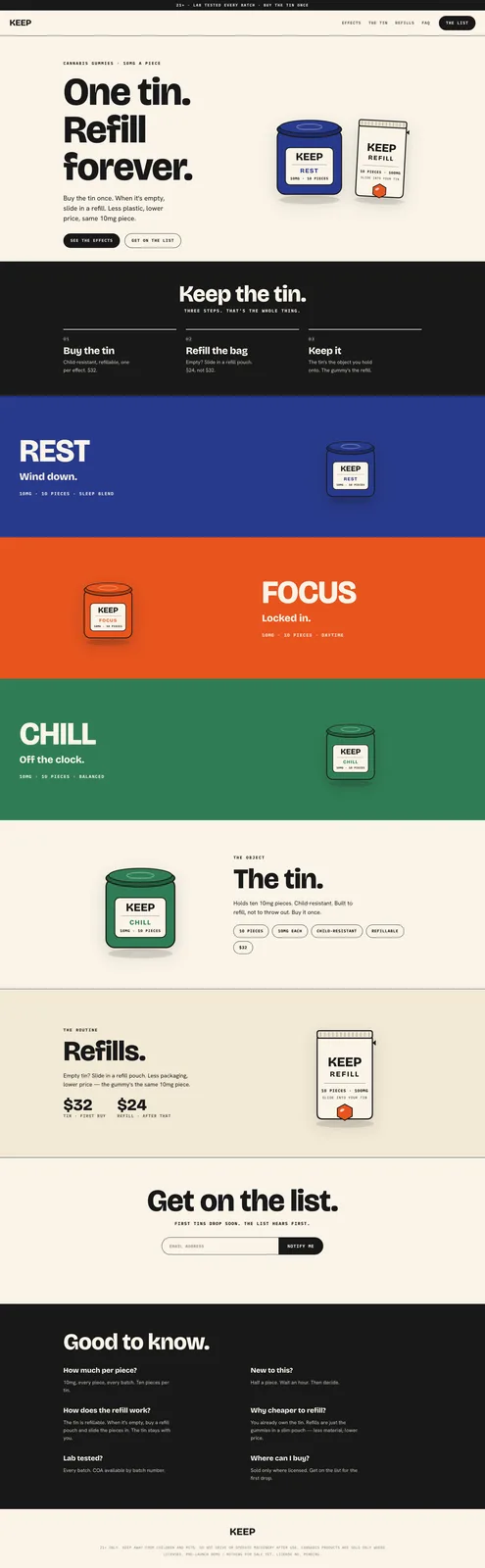
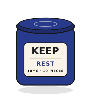
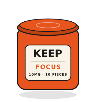
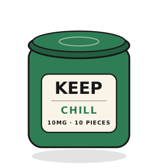
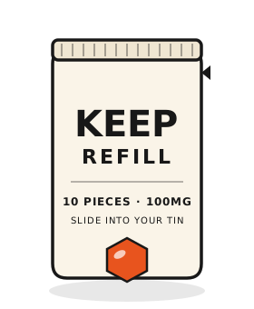


KEEP is a cannabis edible brand built on one circular-economy principle: buy the tin once and refill it indefinitely with mylar pouches. Plants and Chairs translated that model into a complete visual identity where restraint is the hero. The palette is three effect states on a warm paper base with single-weight typography. Numbers communicate dosage as data, not narrative. The packaging system treats the tin as the permanent object and the refill pouch as the consumable.
KEEP started with a simple rule: the tin should outlast the gummies. The brand is built around a circular model where customers buy a permanent aluminum tin once, then purchase mylar refill pouches as needed. That decision became the organizing idea for every visual choice.
The identity is deliberately quiet. A warm paper base carries three effect states - REST indigo, FOCUS orange, CHILL green - each paired with single-weight typography and restrained layout. Dosage reads as data: 10mg per piece, 100mg per tin. No narrative flourishes, no lifestyle cues.
The packaging system separates permanent from disposable. The tin is the keepsake: embossed, minimal, designed to live on a counter. The refill pouch is the consumable: lightweight, recyclable, color-coded by effect. The site removes friction from the loop: reserve the starter tin, understand the three-step model, see the effects, buy the refill.
Launched at keep-edibles.fly.dev, KEEP proves that sustainable design and regulatory compliance can coexist without aesthetic compromise. The whole system is one argument against single-use packaging, made visible through consistency rather than slogans.